Introduction
Your website is one of the most critical assets your business has. It’s the first impression of your business. Most importantly, it’s a 24/7 lead generation machine.
Potential customers will visit your website, get information about the products and services that you offer, and decide whether they want to get in touch with you or not.
Having said that, this critical asset is overlooked many times.
To put things in context, we studied more than 1000+ companies’ websites and found almost a third of businesses’ websites were outdated and needed a complete makeover.
Their design, content, site speed, user flow, updates, upgrades, maintenance, and overall user experience need to be seriously looked at.
The websites weren’t up to the mark as compared with current web standards and needed an overhaul.
But the question is, how do you decide that your website needs an overhaul? What are the common signs to look for?
This blog exactly discusses this. Here are the top five signs.
1. Your website doesn’t convert, hence it needs a makeover

Imagine a visitor landing on your website through SEO or paid ads. The visitor is browsing through the site and has spent thirty minutes on your website but has not filled out the contact form or called the number you provided on the website.
S/he has gone through all your products or services, about us, and contact us pages but is still hesitant to contact you. Next, your website’s tab is closed and the visitor is never going to come back again. (Use visual analytics tools such as Clarity or Hotjar, which give information on how visitors are browsing your website.)
But the question is, why did the visitor not take the next step of contacting you?
Here are a few reasons,
- Visitors had a bad user experience on your website.
- The website is slow to load.
- The navigation is confusing. The website’s structure is not optimized in such a way that it helps visitors follow a clear path.
- The information on the website has not convinced the visitor to make a decision to contact you.
- The website does not offer a clear call-to-action that prompts visitors to take the next step.
2. Your competitors’ websites look and perform better.

Have a look at your top three competitors’ websites, and compare them with your website.
Compare the top five pages, including the home page, any products or services, and contact us.
Analyze where your website stands in terms of content, user experience, loading times, website traffic, and keywords that you rank for on search engines.
If you feel that their website is better than yours, informs better, and establishes trust faster, then congrats you are losing out to them.
3. You have not upgraded your website for the past 1.5 years

Does your website design look like it’s from another era? Then it’s time for redevelopment.
if your website was created more than 1.5 years ago, it’s time for an upgrade.
Why more than 1.5 years?
Based on our experience, if the website is stagnant and non-maintained for that amount of time, it reaches a saturation point beyond which it becomes unengaging and outdated. One cannot have an old website that stays as it is for five to ten years and still expect it to generate business.
So why has it not been upgraded?
Typically, business owners delay website redevelopment for the following reasons
- It’s only been a year since the website was built, and it’s working fine.
- No budget is allocated for website development annually
- Our major source of leads is generated offline, so why worry about the website?
- Revamp will cost us a lot. Let’s use that money for marketing activities.
- Finding a new web agency is time-consuming so let’s delay it this year.
- Our website is just a filler, so it doesn’t need attention.
4. Your brand has changed, hence it needs a makeover

If your brand has changed or you are planning to rebrand, then it’s time for your website to change too.
Typically, companies rebrand for the following reasons
- The business has a new direction.
- The business is ready to go to the next level.
- The products or services offered have significantly changed since the last rebranding.
A rebrand will transform how your company represents itself. Right from your logo, to messaging, to marketing materials, to your pitch.
As a result, it requires a redesign in order to incorporate these branding changes into your website and make sure it’s reflective of your new image.
5. You feel it, your team tells you, or your existing website developer reminds you.

You feel it.
Do you cringe when you see your company’s website? Or do you feel embarrassed about your website?
As a business owner, if you feel that the website is outdated, then it’s the perfect time to get it redeveloped.
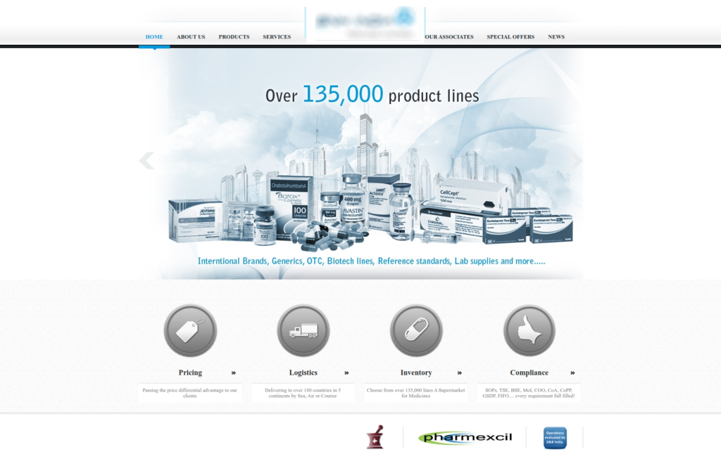
To give a real-life example, here is one of our client’s website home page screenshot. The client approached us to redesign the website because he was dissatisfied with it.

Screenshot 1: Old website of one of our clients.
At first glance at the website, we knew
- The design looks dated, the photos are low quality, and the overall aesthetic is unappealing.
- The business has outgrown. It has evolved over the years, but the website doesn’t go hand in hand with this change.
- Over the years, the site has accumulated design and content inconsistencies, giving users a bad experience.
- The website didn’t incorporate the changes in the business’s marketing strategy, which had changed over the period.
- Visitors were not as interested in the website as they were initially.
Your team tells you
Another sign to watch for is that your team constantly tells you, specifically the marketing and sales team, that the website needs to be upgraded.
Here, business owners tend to ignore such requests since they think it’s not a pressing need.
Your existing website developer reminds you
Another important sign to look for is when your existing website vendor reminds you that the website is aging and needs a revamp.
We ourselves tell our customers that their website has not been redeveloped for more than two years and needs serious attention.
Since we know the market’s trends inside out, we warn our clients that websites need to be upgraded even before they become stagnant and outdated.
Conclusion
We discussed the top signs that you need to look for when determining whether your website needs a makeover or not.
The next step is to head over to your website, go through these signs, and check if you feel that the website is stagnated, outdated, and needs an overhaul.
Also, discuss this with all the stakeholders, specifically with your marketing and sales team.
If you need expert advice on this, feel free to talk with our website experts.


